The Ultimate List of High-Converting Checkout Page Designs
The Best Ecommerce Checkout Page Designs (And What Makes Them Work)
Ecommerce checkout page design is one of the highest-impact places to improve your online store’s revenue — and most retailers underinvest in it.
Here are the design elements that consistently drive the highest conversions:
| Element | Why It Matters |
|---|---|
| Guest checkout | 24% of shoppers abandon when forced to register |
| Transparent pricing | 48% abandon due to unexpected extra costs |
| Multiple payment methods | Up to 9% leave if their preferred method is missing |
| Trust badges & security signals | 18-19% abandon over security concerns |
| Mobile-optimized layout | Over 60% of ecommerce traffic comes from mobile |
| Minimal form fields | 17% abandon checkout that feels too long or complex |
| Progress indicators | Reduces anxiety in multi-step flows |
| One-page checkout | Can reduce abandonment by ~20% on average |
Around 70% of shoppers abandon their cart before completing a purchase. That’s not mostly a traffic problem or a pricing problem. For millions of online stores, it’s a design problem.
A confusing layout, a surprise shipping fee, a form that won’t accept a phone number — any one of these can kill a sale that was already won.
The good news? Most checkout abandonment is fixable. And the fastest way to fix it is to see what great checkout design actually looks like in practice.
This guide showcases real-world checkout page designs that get results — and breaks down exactly why they work, so you can apply the same thinking to your own store.

Why Ecommerce Checkout Page Design is the Ultimate Conversion Lever
We often tell our clients at Redline Minds that the checkout page is the most sensitive part of the entire buyer journey. Think about it: the customer has already done the hard work of finding your site, browsing products, and deciding they want to buy. But 70% of checkouts are ultimately abandoned at the very last second.
When you optimize your ecommerce checkout page design, you aren’t just making things “look pretty.” You are removing the roadblocks between a “maybe” and a “yes.” Research shows that 18% of shoppers cite a bad checkout experience as their primary reason for leaving. By focusing on Conversion Rate Optimization (CRO), you can reclaim that lost revenue.
An optimized checkout builds long-term customer loyalty. If the process is painless, they’ll come back. If it’s a struggle, they won’t. We use psychological triggers like “perceived value” and “effort reduction” to ensure the customer feels confident. When a checkout feels secure and fast, the buyer’s anxiety drops, and your conversion rate climbs.
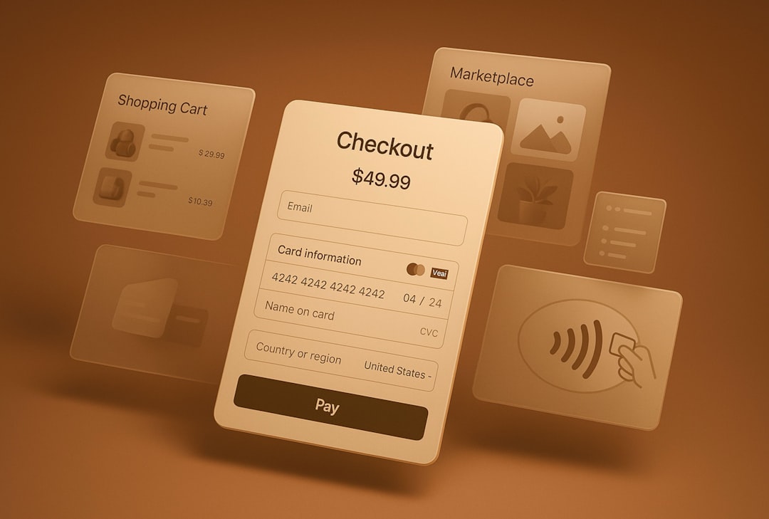
Essential Components of a High-Converting Checkout Page
What actually goes into a world-class checkout? It’s a mix of information and reassurance. We’ve found that the best designs follow a “don’t make me think” philosophy.

The Order Summary
Never make a customer click “back” to see what they are buying. A persistent order summary—including product images, quantities, and specific attributes like size or color—should be visible throughout the process.
Transparent Pricing and Guest Checkout
Surprise fees are the #1 conversion killer. In fact, 48% of shoppers bail when they see unexpected shipping costs or taxes at the final step. You must display these costs as early as possible. Furthermore, you should Enable Guest Checkouts to reduce friction. Forcing someone to create an account is like asking for a second date before the first one is even over; 24% of people will simply walk away.
Security and Trust Signals
Since 19% of abandoned carts are due to security concerns, your design must look professional. This means including SSL/TLS badges, recognizable payment logos (Visa, Mastercard, PayPal), and even a small “Secure Checkout” lock icon.
Support and Policies
Sometimes a customer just has one last question. Providing a “Need Help?” link or a live chat bubble directly on the checkout page can save a sale. Similarly, you can Increase Sales with Good Return Policy visibility. Knowing they can return the item if it doesn’t work out gives them the “safety net” they need to click that “Place Order” button. Check out our guide on Ecommerce Payment Options to see how different methods impact this trust.
One-Page vs. Multi-Step: Choosing the Right Ecommerce Checkout Page Design
One of the oldest debates in Ecommerce Website Design is whether to put everything on one page or break it into steps.
| Feature | One-Page Checkout | Multi-Step Checkout |
|---|---|---|
| Speed | Feels faster to the user | Can feel slower due to loading |
| Psychology | Lower perceived effort | Reduces “cognitive load” (focuses on one thing at a time) |
| Data | Offers ~7.5% higher conversion rates | Better for complex shipping/B2B |
| Analytics | Harder to see exactly where users drop off | Easy to track drop-off at each step |
While One-page checkouts offer higher conversion rates for most B2C stores, multi-step checkouts are excellent for high-ticket items where customers need to feel a sense of “deliberation.” If you use multiple steps, progress indicators are mandatory. They act as a map, telling the user exactly how much work is left (e.g., Shipping → Payment → Review).
For those looking for a middle ground, “accordion” layouts are fantastic. They keep the user on one page but only expand the section they are currently working on, which is a technique we often use when Building Great Landing Pages.
Reducing Friction in Your Ecommerce Checkout Page Design
Friction is anything that slows the customer down. To fight it, we recommend:
- Field Reduction: If you don’t need their middle name or fax number, don’t ask for it.
- Auto-fill: Use Google Address Autocomplete to save them from typing their full address.
- Inline Validation: Show a green checkmark when a field is correct or a helpful error message (like “Please enter a valid zip code”) the moment they make a mistake, rather than waiting until they hit “Submit.”
- Buyer Mindset: Optimizing a checkout page for the buyer’s mindset means making them feel in control. Let them edit their cart without leaving the checkout page.
By focusing on these small technical tweaks, you Create a Great Customer Experience for E-Commerce that feels effortless.
Mobile-First Ecommerce Checkout Page Design
In 2022, nearly 42% of all retail ecommerce occurred on mobile. If your checkout isn’t “thumb-friendly,” you are losing half your sales.
Mobile optimization isn’t just about shrinking the desktop site. It means:
- 44px Buttons: Buttons must be large enough to tap easily without hitting something else.
- Digital Wallets: Apple Pay and Google Pay are life-savers on mobile because they bypass the need to type in credit card numbers.
- Responsive Forms: Keyboards should automatically switch to “numeric” when the user clicks the “Zip Code” or “Credit Card” field.
- Speed is King: Since Page Load Speed is a major factor, keep images compressed and scripts minimal. A one-second delay can drop conversions by 7%.
For more on making your mobile experience shine, see our tips on Perfect Product Page Design.
Advanced Strategies for B2B and Hybrid Checkout Flows
At Redline Minds, we specialize in B2B and hybrid stores. These checkouts are a different beast. B2B buyers aren’t usually “impulse” shopping; they are performing a job function.
- Bulk Ordering: Allow users to upload a CSV or enter SKUs directly into the checkout to add items in bulk.
- Account-Based Pricing: Ensure that once a B2B client logs in, their specific negotiated rates are reflected in the checkout.
- Purchase Orders (PO): Many B2B companies don’t use credit cards. Offering “Pay by PO” or “Net 30” terms is essential.
- Tax Exemption: Provide a way for customers to upload their tax-exempt certificates directly during the flow.
- Approval Workflows: Sometimes, the person filling the cart isn’t the person authorized to pay. Your checkout might need a “Save for Approval” button.
We often use a variety of 27 Conversion Optimization Tools to track how these complex flows perform. Shipping and Return Policies Influence Sales just as much in B2B as they do in B2C. A great B2B checkout should feel as easy as a B2C one, but with the “heavy lifting” capabilities of an enterprise system. This starts with What Makes a Great Homepage for Ecommerce? and carries all the way through to the final “Thank You” page.
Frequently Asked Questions about Ecommerce Checkout Page Design
Should I force users to create an account?
In a word: No. Forced registration is one of the fastest ways to lose a sale, causing a 24% abandonment rate. Instead, offer a guest checkout. If you really want them to have an account, ask them to “Save your info for next time” after they have already completed the purchase. By then, the friction is gone, and they are much more likely to say yes.
How many payment methods should I offer?
Offering a diverse range of payment methods can lead to a 12-15% lift in conversions. Research shows that up to 9% of shoppers abandon when preferred methods are missing. At a minimum, you should offer major credit cards, PayPal, and a digital wallet (Apple/Google Pay). For higher-priced items, adding a “Buy Now, Pay Later” (BNPL) option like Klarna or Affirm can increase sales by up to 27%.
How do I measure checkout performance?
You can’t fix what you don’t measure. We recommend using tools like Google Analytics 4 to track “Checkout Behavior.” Look for high “exit rates” on specific pages. If everyone leaves at the “Shipping” step, your shipping costs are likely too high. We also use heatmaps and session recordings to see where users get stuck or frustrated. Finally, A/B testing different button colors, CTA text (e.g., “Buy Now” vs. “Complete Purchase”), and layouts is the only way to know for sure what works for your specific audience.
Conclusion
Mastering ecommerce checkout page design is a continuous journey of testing, learning, and refining. Whether you are running a small boutique or a complex B2B operation, the goal remains the same: make it as easy as possible for the customer to give you their money.
At Redline Minds, we live and breathe this stuff. From our home base in Jefferson City, Tennessee, we help retailers across the country turn their struggling checkouts into conversion machines. We specialize in the “tricky” stuff—B2B workflows, hybrid store models, and deep SEO integration.
If your cart abandonment rate is higher than you’d like, it’s time to take a closer look at your design. Optimize your payment strategy today and start capturing the revenue you’ve been leaving on the table. We’re here to help you build a store that doesn’t just look great, but performs even better.