Checkout Optimization Tips to Turn Window Shoppers into Buyers

Why Most Shoppers Leave Without Buying (And How to Fix It)
The best ecommerce checkout optimization tips can be summarized quickly:
- Offer guest checkout — don’t force account creation
- Reduce form fields — only ask for what you need
- Show all costs upfront — no surprise fees at the end
- Support multiple payment methods — cards, digital wallets, Buy Now Pay Later
- Optimize for mobile — fast, thumb-friendly, and responsive
- Display trust signals — security badges, SSL, reviews
- Add progress indicators — show shoppers where they are in the process
- Provide multiple shipping options — with clear delivery dates
- Send abandoned cart emails — recover lost sales automatically
- Use inline form validation — fix errors in real time, not at submission
You’ve done the hard part. You ran the ads. You got the traffic. A real person added something to their cart.
Then they left.
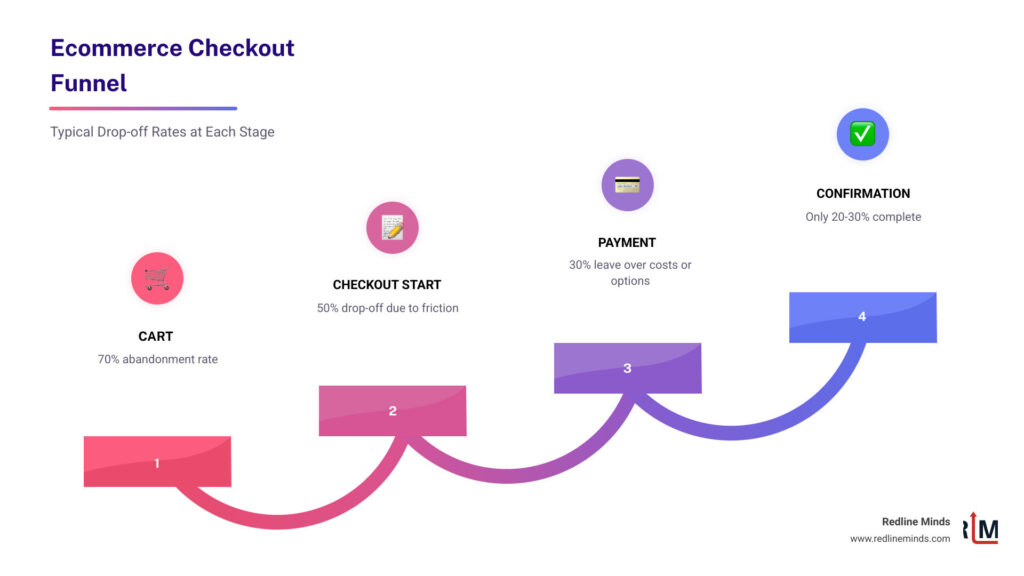
Nearly 70% of online shoppers abandon their carts before completing a purchase. That’s not a rounding error — that’s the majority of your potential revenue walking out the door.
For a mid-sized retailer doing $1M–$10M a year, even a modest improvement in checkout completion can mean hundreds of thousands of dollars in recovered revenue. The customers reaching your checkout are your highest-intent visitors. They’re not browsing. They’re ready to buy — until something gets in the way.
That “something” is almost always friction. A confusing form. An unexpected shipping fee. A payment option they don’t trust. A checkout that looks broken on their phone.
The good news? These are all fixable problems.
This guide breaks down the most impactful checkout optimization strategies — the ones backed by real data — so you can stop losing sales you’ve already earned.
Why Ecommerce Checkout Optimization Tips are Critical for Growth
When we talk about growing an online store, most owners immediately think of spending more on Facebook ads or chasing the latest SEO hacks. While those are important, they focus on the “top of the funnel.” Checkout optimization focuses on the very end—the moment where money actually changes hands.
Think of it this way: if you spend $10,000 to get 1,000 people to your site, but your checkout is so clunky that only 10 people buy, your cost per acquisition is $1,000. If you use Conversion Rate Optimization (CRO) to double that completion rate, you’ve just cut your marketing costs in half without spending an extra dime on ads.

As the research shows, nearly 70% of online shoppers abandon their carts. This is a staggering amount of revenue slipping through your fingers. Optimization is about revenue recovery. By focusing on creating a great customer experience for e-commerce, you protect your investment in customer acquisition.
For our B2B and hybrid store clients, the stakes are even higher. B2B buyers often have complex requirements—tax exemptions, purchase orders, or multi-user accounts. If your checkout can’t handle these smoothly, those high-value professional buyers will head straight to a competitor who makes their job easier.
Streamlining the User Journey to Reduce Friction
Friction is the enemy of the “Buy” button. Every extra click, every confusing label, and every unnecessary form field gives a shopper a reason to pause. And in ecommerce, a pause usually leads to a closed tab.
One of the biggest culprits? Over-complicated forms. Research from the Baymard Institute shows that 26% of cart abandoners leave due to forced account creation. People value their time and their privacy. If they feel like they’re being interrogated just to buy a pair of socks, they’re gone.
To fix this, we recommend a “minimalist” approach to ecommerce website design. You should only ask for the information absolutely necessary to fulfill the order.
The Essential Checkout Field List:
- Full Name
- Email Address (for receipts and tracking)
- Shipping Address
- Billing Address (or a “Same as Shipping” checkbox)
- Payment Information
Anything else—like “How did you hear about us?” or “What is your date of birth?”—should be optional or moved to the post-purchase page.
Another high-impact tip is implementing address autocomplete. Entering an address on a mobile phone is a nightmare. Address lookup tools yield a 30% uplift in conversions because they allow users to type a few characters and tap their address from a list. It’s faster, easier, and prevents delivery errors.
Finally, don’t wait until the user hits “Submit” to tell them they made a mistake. Use inline validation. This provides immediate feedback—like a green checkmark when a zip code is valid or a red warning if an email is missing the “@” symbol. A classic study found a 22% average improvement with inline validation because it keeps the momentum going rather than forcing the user to backtrack.
Implementing Guest Checkout as a Primary Ecommerce Checkout Optimization Tip
If there is one “golden rule” of ecommerce checkout optimization tips, it is this: Offer a guest checkout.
Forcing a first-time buyer to create an account, verify their email, and create yet another password is a massive hurdle. By providing a frictionless entry, you allow them to complete the transaction while they are still in the “buying mood.”
But what about your marketing team? They want those accounts for retention! Here is the secret: you can still get the account. Just ask for it after the purchase is complete. On the “Thank You” page, you can say, “Want to track your order and save 10% on your next purchase? Just create a password to save your info.” At that point, the shopper is already happy they bought something, and their info is already in your system. It’s a one-click win for everyone.
This also helps you collect valuable zero-party data. When a user checks out as a guest, you still get their email and purchase history. Combined with an increase in sales through a good return policy, you build the trust necessary to turn that guest into a lifelong loyal customer.
Using Progress Indicators to Guide Shoppers
Have you ever been in a checkout flow and wondered, “How many more pages of this are there?” That uncertainty creates anxiety, and anxiety kills conversions.
Progress indicators are visual cues that tell the shopper exactly where they are: 1. Shipping > 2. Payment > 3. Review. This simple element provides a sense of control and “light at the end of the tunnel.” It’s a core component of perfect product page design and checkout flow.
There is often a debate between multi-step and one-page checkouts. While both can work, many brands find that condensing the process helps. For example, the brand White Stuff saw a 37% increase in conversion with one-page checkout. By showing everything on one screen, you remove the “fear of the unknown” and let the user see exactly what is required to cross the finish line.
Optimizing Payments and Shipping for Maximum Trust
Once a user reaches the payment section, their “security radar” goes on high alert. This is the most sensitive part of the journey. If they don’t see their favorite payment method, or if the price suddenly jumps because of hidden fees, they will bail.
Transparency is your best friend here. 7% of users abandon due to lack of preferred payment options. In today’s market, “Credit Card” isn’t enough. You need to meet customers where they are.
| Payment Type | Key Benefits | Popular Providers |
|---|---|---|
| Digital Wallets | One-tap checkout, no typing card info | Apple Pay, Google Pay |
| Buy Now, Pay Later | Increases AOV, spreads cost for buyer | Klarna, Affirm |
| Traditional | Universal acceptance | Visa, Mastercard, Amex |
Offering ecommerce payment options that include digital wallets is especially vital for mobile users who don’t want to dig their physical wallet out of their pocket.
Mobile-First Ecommerce Checkout Optimization Tips
We live in a mobile-first world. 54% of eCommerce purchases are mobile, and that number is only growing. If your checkout was designed for a 27-inch desktop monitor and just “shrunk down” for a phone, you are losing money.
Mobile optimization means:
- Large, thumb-friendly buttons: No one should have to “pinch and zoom” to click “Next.”
- Correct Keyboards: When a user taps the “Phone Number” field, the numeric keypad should automatically pop up.
- Speed: On mobile, every second feels like an hour. Page load speed is a primary conversion factor. A 2-second load delay increases abandonment by 87%.
Biometric authentication (FaceID or TouchID) via digital wallets is the ultimate mobile optimization. It turns a 2-minute typing chore into a 2-second tap.
Building Trust with Security Signals and Transparent Shipping
Trust is the currency of the internet. Since the customer can’t physically see you or hold the product, they look for “trust signals.”
First, ensure your shipping and return policies influence sales positively by making them clear and easy to find. Don’t hide your return policy in the footer in 6pt font.
Second, use trust badges. Whether it’s an SSL certificate, a “Money Back Guarantee,” or a “Secure Payment” icon, these small graphics provide peace of mind. Trust badges deliver up to 30% uplift in conversion for brands that aren’t yet household names.
Third, be precise about delivery. “Ships in 3-5 days” is vague. “Arrives by Wednesday, Oct 12th” is a promise. People buy based on deadlines—birthdays, holidays, or upcoming trips. The retailer Elon boosted conversion by 15% with tailored delivery options that gave customers clear dates and choices.
Advanced Strategies: Upselling and Cart Recovery
Optimization doesn’t stop once the user enters their credit card. There are two “pro-level” strategies that can significantly impact your bottom line: increasing the order value and chasing the ones that got away.
Increasing Average Order Value (AOV): The checkout page is a great place for “impulse buys,” but you have to be careful not to distract the user from the main purchase. Shopping cart add-ons account for 10–30% of revenue for many stores. Think of these like the candy bars at the grocery store checkout—small, relevant, and easy to add with one click.
You can also leverage a post-checkout referral module or a loyalty experience on the confirmation page. This turns a single sale into a potential multi-customer acquisition event.
Recovering Abandoned Carts: Even with the best ecommerce checkout optimization tips, some people will still leave. Life happens—the baby cries, the phone rings, or the Wi-Fi cuts out. This is where 27 conversion optimization tools like exit-intent popups and automated email sequences come in.
An exit-intent offer can trigger a small discount or a “free shipping” code the moment a user moves their mouse toward the “X” button. If they do leave, a well-timed abandoned cart email (sent 1 hour, 24 hours, and 72 hours later) can recover up to 15-20% of those lost sales.
Frequently Asked Questions about Checkout Optimization
What is a good checkout conversion rate?
While it varies by industry, a good benchmark for an optimized ecommerce site is a conversion rate of 20-30% at the checkout stage (from “Started Checkout” to “Completed Purchase”). If your rate is below 15%, you likely have significant friction points or technical bugs that need immediate attention. Always track your own baseline and aim for incremental improvements.
Should I use a one-page or multi-step checkout?
This is a classic “it depends” situation, and the best way to find out is through A/B testing.
- One-page checkouts are often better for simple, low-cost impulse buys because they feel faster.
- Multi-step checkouts can be better for high-ticket items or B2B sales where users want to verify information at each stage to ensure accuracy.
On mobile, multi-step (with very few steps) often wins because it reduces the “cognitive load” by only showing one task at a time. However, one-page checkouts offer higher conversion rates for many standard retail brands.
How do I reduce shipping-related abandonment?
The #1 reason for abandonment is “unexpected costs.” If a user sees a $50 item and then sees $15 shipping at the very last second, they feel deceived.
- Be Transparent: Show shipping estimates on the product or cart page.
- Free Shipping Thresholds: “Spend $10 more for Free Shipping” is a powerful motivator.
- Variety: Brands with multiple delivery options see a 27% conversion increase on average. Offer a mix of economy, express, and local pickup options to satisfy different needs.
Conclusion
At Redline Minds, we know that ecommerce success isn’t just about getting people to your site—it’s about making sure they can actually buy what you’re selling. Based in Tennessee, our team specializes in B2B and hybrid store optimization, helping retailers navigate the complexities of modern digital commerce.
Whether you need help with strategy development, UX/UI design, or technical SEO, we focus exclusively on the ecommerce space to ensure your store is built for growth. Don’t let your hard-earned traffic go to waste at the finish line.
Ready to stop the leaks in your funnel? Scale your ecommerce marketing today with the experts who understand the science of the sale.
Share this article
Tap into years of experience and turn your site’s visitors into buyers.
Related Posts
-

The Definitive Guide to Virtual Ecommerce Directors
Hire a virtual ecommerce director to scale revenue, optimize CRO, and lead remote eCommerce growth strategically.
-

The Best SEO Tool for Shopify Stores
Discover the best SEO tool for Shopify in 2025. Compare top apps like TinyIMG & Booster SEO for…
-

How to Audit Your Store Before Google Does
Conduct your ecommerce site audit: fix revenue leaks, boost conversions, and optimize performance with our expert checklist and…