
How to Prototype Your Way to a Better Ecommerce App

Why a UX UI Ecommerce Prototype Is the Smartest Investment You Can Make
A UX UI ecommerce prototype is a testable, interactive model of your online store — built before a single line of code is written. It maps out how shoppers will move through your site, from landing page to checkout.
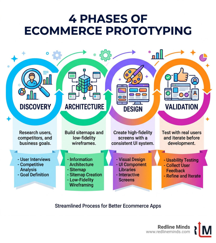
Quick answer: Here’s how to prototype your way to a better ecommerce app:
- Discover — Research your users, competitors, and business goals
- Architect — Build sitemaps and low-fidelity wireframes
- Design — Create high-fidelity screens with a consistent UI system
- Validate — Test with real users and iterate before handing off to developers
If your store is stuck at a sales plateau, the problem is often not your products — it’s the experience around them.
The numbers back this up. Research shows that effective UI design alone can lift conversions by up to 200%, while excellent UX can push that figure to 400%. Meanwhile, ecommerce sales are projected to hit $4.9 trillion globally by 2025.
The stores that capture that growth won’t just have good products. They’ll have frictionless experiences — and those experiences are built through prototyping.
Prototyping lets you catch costly mistakes early, align your team on a shared vision, and test real user flows before committing to development. Done right, it’s the difference between launching a store that converts and one that frustrates.
This guide walks you through each phase of the process — from strategic discovery to developer handoff — with practical steps you can apply to your own store.
Phase 1: The Strategic Foundation of a UX UI ecommerce prototype
Before we start picking out pretty colors or trendy fonts, we have to dig into the “why.” At Redline Minds, we’ve seen too many businesses jump straight into the visual design only to realize later that the site doesn’t actually serve their customers’ needs. The Discovery stage is where we build the foundation for your UX UI ecommerce prototype.
In this stage, we align business goals with user personas. Are you a B2B wholesaler needing complex bulk-order features, or a boutique D2C brand focusing on visual storytelling? Your prototype needs to reflect these differences from day one. We also have to consider the global landscape. According to research from the World Health Organization (WHO), approximately 15% of the world’s population lives with some form of disability. This makes accessibility not just a “nice-to-have,” but a paramount requirement for any modern ecommerce website design.
Research Methods for Your UX UI ecommerce prototype
We don’t guess; we gather evidence. A professional design process involves several layers of research:
- Competitor Benchmarking: We look at what your competitors are doing right—and where they are failing. This helps us find opportunities for your brand to stand out.
- Customer Journey Mapping: We visualize every touchpoint a customer has with your brand, from seeing a social media ad to receiving their package.
- Data Analysis: If you have an existing site, we look at heatmaps and analytics to see where people are dropping off.
- Usability Heuristics: We rely heavily on the Baymard Institute usability heuristics. They have conducted over 54,000 hours of moderated usability research, providing a gold standard for what actually works in ecommerce.
Defining the Commerce Blueprint
Once the research is in, we create what we call a “Commerce Blueprint.” This is a series of workshops and documents that define the project scope and technical requirements. For our B2B and hybrid store clients, this is where we tackle the “tough stuff,” like tiered pricing, account management, and complex shipping logic.
We also use this time to decide on the right starting point for your store. Sometimes a custom build is necessary, but other times, a well-chosen template can be the right move if it’s modified correctly. You can read more about what to consider before you choose or design a new template for your online store to ensure you aren’t boxing yourself into a corner.
Phase 2: Information Architecture and Wireframing
Now that we have a strategy, it’s time to build the “skeleton” of your store. This is known as Information Architecture (IA). Think of it like the blueprints for a house. You wouldn’t start picking out wallpaper before you know where the walls and plumbing go, right?

We use tree diagrams and sitemaps to organize how pages relate to one another. This ensures that your navigation logic is sound and that a customer is never more than a few clicks away from what they need. A critical part of this is the homepage. It’s your digital storefront window, and it has to do a lot of heavy lifting. Check out our guide on what makes a great ecommerce homepage to see how we balance branding with functionality.
Low-Fidelity Prototyping Essentials
Low-fidelity (lo-fi) prototyping is all about speed and structure. We often use tools like Balsamiq or Miro to create grayscale layouts. By stripping away colors and images, we can focus entirely on:
- Utility: Does the page contain the necessary tools for the user?
- Usability: Is it easy to use and navigate?
- Cognitive Load: Are we overwhelming the user with too many choices?
When building an ecommerce website, these lo-fi wireframes allow us to iterate quickly. If a layout isn’t working, we can change it in seconds rather than hours.
Structuring the Purchase Path
The heart of your UX UI ecommerce prototype is the purchase path. This is the sequence of screens that leads a user from discovery to a “Thank You” page. We pay special attention to:
- Product Grids and Filters: Can users find exactly what they want without frustration?
- Search Functionality: Is the search bar prominent and does it provide relevant results?
- Cart Logic: Does the cart clearly show totals, shipping estimates, and “Save for Later” options?
- The Perfect Product Page: This page is where the sale actually happens. We focus on high-quality layouts that include trust signals and clear CTAs. We’ve even written a deep dive on perfect product page design to help you master this component.
Phase 3: High-Fidelity Design and Mobile Optimization
Once the wireframes are approved, we move into High-Fidelity (hi-fi) design. This is where your brand comes to life. We use tools like Figma or Adobe XD to create pixel-perfect screens that look and feel like the final product.
| Feature | Low-Fidelity Prototype | High-Fidelity Prototype |
|---|---|---|
| Visuals | Grayscale, shapes, and placeholders | Real images, brand colors, and typography |
| Interactivity | Basic linking between pages | Complex transitions and micro-interactions |
| Purpose | Test logic and structure | Test visual appeal and brand alignment |
| Speed | Very fast to produce | Takes longer to refine |
During this phase, we implement “Atomic Design.” This means we create small, reusable components (like buttons, input fields, and icons) that combine to form larger sections. This ensures total consistency across your entire store. We also ensure everything meets WCAG 2.1 AA accessibility standards, which is vital for reaching that 15% of the population we mentioned earlier.
Optimizing the Mobile UX UI ecommerce prototype
In today’s market, mobile optimization isn’t an afterthought—it’s the priority. Most shoppers will find your store on their phones, often through social commerce platforms which are expected to reach €1.1 trillion by 2025.
Our mobile-first approach includes:
- 44×44 Pixel Touch Targets: Ensuring buttons are large enough to be tapped easily without errors.
- Thumb-Zone Mapping: Placing critical elements (like “Add to Cart”) within easy reach of a user’s thumb.
- Responsive Breakpoints: Designing for everything from the smallest smartphone to the largest ultra-wide monitor.
- Speed Optimization: Google considers 2 seconds the maximum acceptable load time, but we aim for 0.5 seconds for peak performance. You can read more about how page load speed impacts your bottom line.
UI Kits and Design Consistency
To keep your UX UI ecommerce prototype professional, we use comprehensive UI kits or design systems. These include:
- Typography: Consistent heading levels and readable body text.
- Color Variables: A defined palette that aligns with your brand guidelines.
- Micro-interactions: Small animations (like a button changing color when hovered) that provide feedback to the user and make the site feel “alive.”
- Visual Hierarchy: Using size and color to guide the user’s eye to the most important information first.
Phase 4: Testing, AI Tools, and Handoff
The prototype is “finished,” but is it right? Phase 4 is all about validation. We don’t want to hand over a design to developers until we know it works for real people.
Validating the User Experience
We use several methods to test our prototypes:
- Usability Testing: Watching real users try to complete a task (like “find a blue shirt and buy it”) and noting where they get confused.
- Heatmaps: Seeing where users click most often.
- CRO (Conversion Rate Optimization): Making small tweaks to layouts to see which version leads to more sales.
We also keep an eye on Google Core Web Vitals. These metrics help us understand if the user experience is stable and fast enough to rank well in search results.
AI Tools and Speeding Up the Process
Technology is moving fast, and we use it to our advantage. Tools like Figma Make allow us to generate initial layouts and interactive flows using natural language prompts. This doesn’t replace the designer’s eye, but it acts as a massive “accelerator,” letting us move from idea to shoppable prototype in record time. It’s particularly useful for building out repetitive pages like user profiles or FAQ sections, so we can spend more time on the high-impact areas like the checkout flow.
Developer Handoff and Documentation
The final step is the handoff. We don’t just “throw the design over the wall.” We provide detailed documentation using tools like Storybook or Zeroheight. This includes:
- Asset Exports: All images and icons in the correct formats.
- CSS Styles: Exact specifications for colors, fonts, and spacing.
- Interaction Notes: How animations should behave.
This level of detail ensures the final coded site looks exactly like the prototype we tested. If you’re looking for a partner to handle this entire journey, we offer various ecommerce design packages tailored to different business sizes and needs.
Conclusion and FAQ
Prototyping is the bridge between a “good idea” and a “profitable store.” By investing in a UX UI ecommerce prototype, you reduce development waste, improve user satisfaction, and ultimately drive more revenue.
At Redline Minds, we specialize in helping retailers in Tennessee and beyond navigate this complex process. Whether you are building a B2B portal or a hybrid retail store, our focus is always on creating a frictionless path to purchase. Ready to see what a professional prototype can do for your business? Explore our ecommerce services and let’s start building.
How does a prototype impact ecommerce sales?
A prototype allows you to identify and fix “friction points”—places where users get confused or frustrated—before the site goes live. By streamlining the navigation and checkout process in the design phase, you can increase conversion rates by up to 400%. It ensures that when you finally launch, you are launching a sales machine, not a guessing game.
What are the most common ecommerce UX mistakes?
The biggest mistakes include overly complex navigation, hidden “Add to Cart” buttons, and a lack of mobile optimization. Another common error is failing to communicate the product’s value immediately. If a user has to hunt for the price, shipping info, or return policy, they are likely to bounce to a competitor.
How can AI tools like Figma Make speed up prototyping?
AI tools like Figma Make can generate entire layouts, navigation structures, and product pages from simple text prompts. This allows designers to skip the tedious work of building basic components from scratch and instead focus on the strategic “logic” and unique branding that makes a store successful. It can turn a process that used to take weeks into one that takes days.
Share this article
Tap into years of experience and turn your site’s visitors into buyers.
Related Posts
-

The Complete Guide to Affiliate App for Shopify
Discover the best affiliate app for Shopify to grow sales, manage referrals, and boost merchant revenue in 2026.
-

The Ultimate Guide to Types of E-Commerce Payment Systems
Learn the types of e commerce payment system to boost sales and reduce cart abandonment in this complete…
-

A Practical Guide to AI Agent Integration Methods
Learn how AI agent integration connects enterprise systems with MCP, Unified APIs, and custom code for secure, real-time…