The Ultimate Guide to eCommerce UX That Actually Converts
Why UX Design for Online Stores Directly Impacts Your Revenue
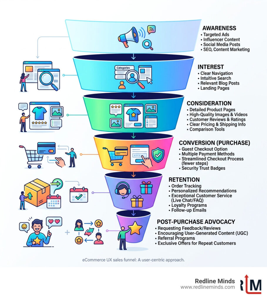
UX design for online stores is the practice of designing every part of your online shopping experience — navigation, product pages, checkout, search, and more — so customers can find what they need and buy it with as little friction as possible.
Here are the core elements that make eCommerce UX work:
- Site speed — pages load in under 3 seconds
- Intuitive navigation — shoppers find products without thinking hard
- Clear product pages — images, descriptions, pricing, and reviews answer every question
- Streamlined checkout — fewer steps, more payment options, guest checkout available
- Mobile optimization — the full experience works perfectly on a phone
- Trust signals — security badges, reviews, and transparent shipping policies
The business case is hard to ignore. According to Forrester Research, good UX design can increase conversions by up to 400%. And spending just $1 on UX improvements returns an estimated $100 in value. Yet 70.19% of all shopping carts were abandoned in 2024 — most of those losses are a direct result of poor UX.
Think about the last time you walked into a well-organized store. Products were easy to find, the staff were helpful, and checkout was quick. Now think about the opposite — cluttered aisles, no signage, long lines. You left. Your customers do the same thing online, except they leave in seconds and rarely come back. In fact, 88% of online consumers say they’re less likely to return after a bad experience.
If your store is doing $1M–$10M in annual revenue but growth has stalled, UX is often the highest-leverage place to look. This guide walks you through everything: the principles, the tactics, and the specific changes that move the needle.
Defining UX Design for Online Stores vs. UI
While many people use the terms interchangeably, User Experience (UX) and User Interface (UI) are two different animals. Think of UI as the “skin” of your store—the colors, fonts, and buttons that make it look pretty. UX is the “skeleton” and the “nervous system”—it’s how the store actually functions.
In UX design for online stores, we focus on customer-centricity and information architecture. It’s about organizing your categories so a shopper doesn’t feel like they’re looking for a needle in a haystack. While a flashy UI might win design awards, a superior UX wins customers. As we often say, Web Design Must Match Your Objective, and for an online store, that objective is almost always to sell.
The Business Case for Superior Usability
If you’re wondering whether investing in UX is worth the effort, consider the ROI. Statistics show that spending just $1 on UX returns $100. That is a 9,900% return on investment—try finding that in the stock market!
Beyond the raw numbers, good UX slashes your bounce rates. If a user can’t figure out how to filter for their size or find your return policy within seconds, they’re gone. By choosing to Create a Great Customer Experience for E-Commerce, you aren’t just making a “nicer” site; you are building brand loyalty. People return to stores that make their lives easy. In fact, 74% of users are likely to return to a website if it has a good UI/UX.
Core Principles of High-Converting eCommerce UX
The golden rule of UX design for online stores is “Function over Fashion.” We’ve all seen sites that look like modern art but are impossible to navigate. If your “clever” menu hides the search bar, you’re losing money.
Effective UX is built on “cognitive ease.” This means the user shouldn’t have to think. As Steve Krug famously argued in his book Don’t Make Me Think, every click should be a mindless, unambiguous choice. When we work on Conversion Rate Optimization (CRO), we look for “friction”—any moment where a customer pauses, gets confused, or has to work too hard to give you their money.
Designing for Non-Homepage Entry Points
One of the biggest misconceptions in eCommerce is that everyone starts on your homepage. In reality, thanks to SEO and social media ads, most shoppers land directly on a product or landing page.
If your product page doesn’t tell the user who you are and why they should trust you, they’ll leave. For example, Bull & Cleaver’s top traffic driver is a specific product page, not their home page. This is why Building Great Landing Pages that act as self-contained shopping experiences is vital. Every entry point must be optimized to answer the user’s search intent immediately.
Visual Hierarchy and Consistency
Visual hierarchy is the art of telling the user’s eyes where to look first. You want your “Add to Cart” button to pop, not blend into the background. Use whitespace to prevent “choice paralysis”—when there’s too much going on, users do nothing.
Consistency is equally important. Your fonts, colors, and button styles should remain the same from the homepage to the confirmation email. Look at the Dippin’ Dots website for a great example of cohesive branding that feels like a visual extension of the brand. Before You Choose or Design a New Template for Your Online Store, ensure it allows for this kind of rigorous consistency across all page types.
Optimizing the Shopping Journey: From Navigation to Discovery

Navigation should be the “invisible map” of your store. If a user has to hunt for a menu, you’ve already failed. We recommend using mega-menus for stores with large catalogs, as they allow shoppers to see subcategories at a glance without multiple clicks.
However, the best navigation in the world won’t save a slow site. Research shows that 40% of folks will leave if a website takes longer than three seconds to load. We use tools like GTmetrix to identify bottlenecks. Improving your Page Load Speed is often the fastest way to see an immediate bump in revenue.
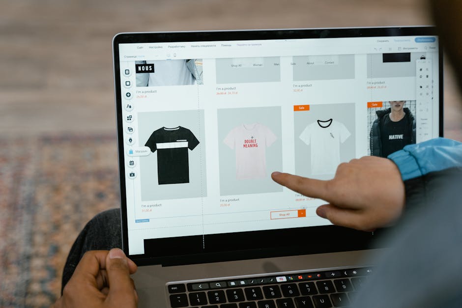
Enhancing Product Pages with UX Design for Online Stores
The product page is where the sale happens. It needs to be a powerhouse of information and persuasion. This means high-resolution imagery—and lots of it. Since customers can’t touch the product, they need to see it from every angle.
Social proof is another non-negotiable. Reviews and ratings give shoppers the confidence to click “buy.” To truly stand out, you might consider tools like the Price Mirror app to show price comparisons, or follow our Perfect Product Page Design checklist. Don’t forget that large images can slow you down; follow The Ultimate Guide to Ecommerce Image Optimization to keep your site snappy.
Intuitive Search and Filtering
For shoppers with “high intent”—those who know exactly what they want—the search bar is their best friend. It should account for typos, offer auto-complete suggestions, and handle synonyms. Timberland’s search, for instance, is excellent at providing relevant results even if you mistype a product name.
Faceted search (filters) allows users to narrow down 500 items to the 5 that actually fit their needs. As Steve Krug points out, if users can’t find it, they can’t buy it. Breadcrumbs are another simple UX win, helping users understand exactly where they are in your site’s hierarchy and how to get back.
Streamlining the Checkout and Payment Experience
The checkout is the most fragile part of the customer journey. This is where 70% of people get cold feet. Why? Usually because the process is too long or they’re hit with “surprise” costs.
| Feature | Guest Checkout | Forced Account Creation |
|---|---|---|
| Speed | Very Fast | Slow |
| Friction | Low | High |
| Conversion Rate | High | Low |
| Retention | Medium | High (if they finish) |
Research shows that 50% of online shoppers abandon their carts when they realize they have to pay unexpected shipping fees or taxes. To combat this, be transparent about costs early and always offer a guest checkout option. A complex checkout is a “revenue killer.”
Building Trust with Security and Transparency
In an era of data breaches, customers are rightfully nervous about handing over their credit card info. Displaying SSL certificates and mentioning PCI DSS standards isn’t just for IT—it’s a UX trust signal.
Transparency regarding shipping and returns is equally vital. If a customer has to dig to find out your return policy, they’ll assume the worst. We recommend keeping Secure data in the cloud and making those security badges visible at the exact moment the customer is reaching for their wallet.
Accelerated Payment Options
Mobile users, in particular, hate typing in long credit card numbers. Accelerated payment options like Shop Pay, Apple Pay, and PayPal allow for a one-click experience. These tools store the user’s info securely, turning a 2-minute form-filling chore into a 2-second tap. By integrating these, you remove the final barrier between “I want this” and “I bought this.”
Mobile-First UX Design for Online Stores
Mobile devices generated 79% of all eCommerce site traffic in late 2025. If you aren’t designing for the phone first, you’re designing for a minority of your customers. Google has also moved to Mobile-first indexing, meaning your search rankings depend on how your site looks on a smartphone.
Shockingly, 81% of major eCommerce sites still have mediocre mobile UX. This is a massive opportunity for you to edge out the competition. A truly responsive Ecommerce Website Design ensures that buttons are “thumb-friendly” (at least 44×44 pixels) and that the text is legible without zooming.
Accessibility and Inclusivity in UX Design for Online Stores
Accessibility isn’t just a legal requirement; it’s good business. Designing your site to be inclusive means that people with visual impairments or motor disabilities can still shop with you. Following the Web Content Accessibility Guidelines (WCAG 2.1) ensures your site works with screen readers and keyboard navigation.
Implementing ADA Compliance Ecommerce standards, such as high color contrast and descriptive alt text for images, actually improves the experience for everyone. A site that is easy for a screen reader to parse is also a site that is easy for a search engine to index.
Frequently Asked Questions about eCommerce UX
Why is site speed considered a UX factor?
Site speed is the foundation of UX. If a page doesn’t load, there is no “experience” to be had. Slow speeds lead to high bounce rates and lower SEO rankings. You can check your current performance using Google PageSpeed Insights to see exactly what is slowing you down.
How does UX design reduce cart abandonment?
UX reduces abandonment by removing friction. This includes offering guest checkout, showing shipping costs upfront, and providing trust signals. When you simplify the process, you remove the “reasons to say no” that shoppers face during the final steps of the journey.
What are the top UX trends for 2024 and beyond?
We are seeing a major shift toward personalization and immersive content. Key trends include:
- Dark Mode: Easier on the eyes and saves battery life.
- Voice Search: 71% of shoppers prefer voice search over typing.
- Video Reviews: 80% of shoppers say video reviews give them more confidence.
- AI Personalization: Tailoring the shopping experience based on past behavior.
Conclusion
At Redline Minds, we know that UX design for online stores is the engine that drives modern eCommerce growth. Based in Jefferson City, Tennessee, we specialize in helping B2B and hybrid stores navigate these complex design challenges. Whether you need a full strategy development or a targeted UX/UI revamp, our team is dedicated to turning your online store into a high-converting machine.
Ready to stop leaving money on the table? Explore our services and let’s build an experience your customers will love.
Share this article
Tap into years of experience and turn your site’s visitors into buyers.
Related Posts
-

The Complete Guide to B2B Ecommerce Trends
Discover the latest B2B ecommerce trends for 2026 and learn how to scale your digital wholesale strategy with…
-

How to Prototype Your Way to a Better Ecommerce App
Master UX UI ecommerce prototype creation: 4 phases from discovery to validation for boosted conversions and sales.
-

Everything You Need to Know About B2B E-Commerce
Master business to business e commerce with this complete guide covering platforms, self-service portals, ERP integration, and proven…